Tuesday 12 October 2010

A Happy Follow-up


I presented the Happiness Presentation I talked about in my previous posts to my two Theory of Knowledge (ToK) classes for the real test. Was it really 'zen'? They praised it!! Here are the highlights of the comments: the word 'simple' came up repeatedly. They loved the simplicity, especially contrasted to my usual density of information on one slide. One student said:
"I like the minimalist design... doesn't hit the eye with information bomb."
More positives included: "time to think & digest more deeply;" the use of 'real-life,' relevant, personal anecdotes/ examples" seemed to be the number one thing that students found "captivating." That they could connect to what I was presenting seemed to make all the difference:
"I could connect to real life."
Others liked the "flow," the "clarity," the "pace," and so many said they enjoyed the presentation. Before I let all of this go to my head, I have to give credit to the 'novelty' factor. I talk about 'novelty' as one of the types of happiness even! It is novel to see such a different type of presentation. But I know why they enjoyed the presentation. It was because I was in the moment. I was story-telling. I felt their connection. It flowed because I loved what I was talking about and they knew it—and I believe this is what made all the difference.

On the 'suggestions for improvement' side, a couple of students thought the font needed to be more professional-looking. One thought I needed to vary the color/ theme per slide. I agree with this and if given a need to revise it, and given the time, I'd look around at different backgrounds that match up with the concepts. One wanted more dynamism in the actual Keynote slides—could be s/he enjoys the transitions. Funny that one students thought the yellow-orange color was "too warm," but another in the same class thought "the color reminds me of happiness!" One person suggested putting a summary slide at the end that shows all the types of happiness on one slide. I think this is a good idea. I wouldn't have to have a cluttered slide like the original, but one showing the different types together, maybe without any other visuals.

So, they liked it—the bottom line—and the real test. If it passes the 'high-school student test,' then it definitely passes! I made it to (Presentation) Zen Pl.!

Sunday 10 October 2010

Course 3 Project Reflection

It didn't take me long to determine where to go with my visual literacy understandings. My Theory of Knowledge (ToK) students and I are about to embark on a trip to ToK Examiner's Land. This is a distant location and requires serious considerations of what to pack—the critical supplies that will be needed to stand up to the Examiners when they meet the students. The Examiners in this cas will be meeting the students through via carefully-crafted essays. The Examiners will judge the students as worthy or not of passing into their land. Without the proper carry-ons and critical equipment, all could be lost at sea. Unpacking, analyzing supplies and creating a special designer bag are required.

We might consider climbing the mountain with the proper equipment. If we meet that challenge, we might set to go to the more distant Examiner's Land. We'll look closely at our supplies first to ensure that they pass inspection. We'll ensure success with proper rest, the right shoes to remain on track, a good GPS so we don't get lost, water to keep us hydrated, a support group just in case we get into trouble, and good communication with our authorities.

To get to the more literal understanding here, my Course 3 Project will allow me and my students to do this essay as prescribed by IB. Once I played with the packing/ climbing a mountain metaphor, I could quickly scribble down the corresponding graphics. I have this all on paper right now, and with the Course Project description, I was able to add the detail I'll need to design a set of graphics, pictures and flow charts to correspond to the metaphor. Actually, the IB examiners do use the packing metaphor for what they call 'unpacking' the Prescribed Titles (questions) the students have to undertake. I just extended it a bit further. Here's the set from this year—a quick overview of these will show how 'unpacking' is essential!

I foresee a chunk of time being needed to design the visuals for this undertaking, however, the argument that I have to take time to set up the unit anyway is a convincing one. Also, it is more fun in some ways... I may as well follow what science does say is an enhanced way to learn—by using visuals—and give it a try. And, the best way to evaluate the project, once again, will be to ask the students. But there will be another way to verify success this time—to see which students make it to Examiner's Land and back!

Saturday 9 October 2010

Metaphor, Visual Literacy & When to go digital


Recently, we've studied the impact of metaphor in the Language unit in my Theory of Knowledge (ToK) class. I used to teach English 10 and remember the challenge of getting 10th graders to first, find a metaphor in a piece of writing (usually poetry) and then, the biggest challenge, to get them to understand its figurative meaning, which often was the key to theme. In ToK, we consider ambiguity as a means to getting the mind to a deeper point of understanding via making an unusual comparison. We consider how it can in fact enhance meaning and understanding, however, because of interpretation and possible problems with denotation and lack of background information, at the same time the use of metaphor can be problematic to meaning and understanding. I've noticed a great leap from the gr. 10 mind to the mind of a senior in high school who now can more readily grasp the deeper meaning and analyze how the process of metaphor actually works. (Ironically, the metaphor above was created by a 9th grade student. He compares the Buddhist cycle of birth and death to that of the water cycle! He includes a detailed explanation of each bit of the drawing and describes accurate comparisons between the two concepts.)

I asked my ToK students to show their understandings of the different metaphors up for discussion, in small groups, to come up with a visual that would reveal the meaning of the metaphors to others. I instructed them to draw something simple with few words, using only paper and pencil. We took up the following:

1) Metaphor for explaining & understanding
2) Metaphor for challenging orthdoxy
3) Metaphors in the IB Diploma Program: e.g. the Big Bang
4) Metaphor for conditioning thought and action

Have a look at the various renditions the students came up with. Can one visual be classified as a 'Digital Story' (assuming it's digital that is)? Consider 'Communications in the human body' (drawing below) under the 'Explaining & understanding' category. Nothing need more be presented about its meaning than the picture and the label to get the meaning, assuming one has had exposure to the concepts depicted in the drawing.

With the aide of a presenter, can the other examples like the 'The Great Leap Forward (in Chinese)' under 'IB metaphors' and 'The Selfish Gene' under 'Challenging orthodoxy' become 'zen presentations'? If I had known about: Punch, Personal, Unexpected, Novel and Challenging, I could have instructed them at the start to incorporate these concepts into the mini-presentations of their metaphor visuals to the class. When they did actually present the visuals, most wanted to come up to the front of the class and use the document camera to display their creations. Some had actually prepared a few written notes for support. In all cases, their was a 'flow' that was evident as they presented what they had created. And in all cases, we could understand the deeper meaning intended by their metaphor. But, can I count these as 'digital' if only the document camera is being used?


An amazing understanding was made in this study that the use of metaphor is pervasive and 'universal.' We naturally slip metaphor into everyday speech as well as the most formal spoken language or written documents. Consider 
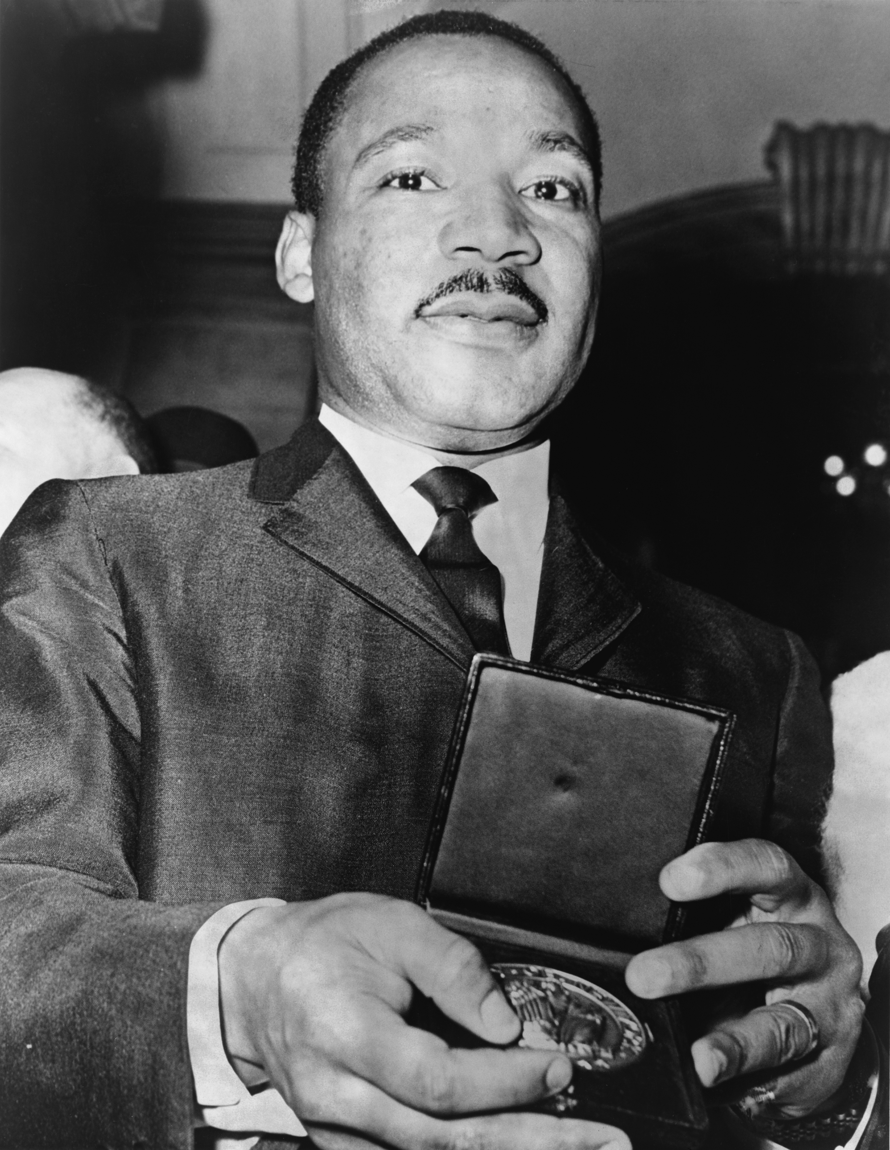
Martin Luther King's Speech: "I Have a Dream" as one of the greatest examples of extended metaphors that could move a whole nation into a new paradigm of governance. Here's a classic excerpt:
"In a sense we've come to our nation's capital to cash a check. When the architects of our republic wrote the magnificent words of the Constitution and the Declaration of Independence, they were signing a promissory note to which every American was to fall heir. This note was a promise that all men - yes, black men as well as white men - would be guaranteed the unalienable rights of life, liberty and the pursuit of happiness. It is obvious today that America has defaulted on this promissory note, insofar as her citizens of color are concerned. Instead of honoring this sacred obligation, America has given the Negro people a bad check, a check which has come back marked 'insufficient funds.'"
What a way to affect the African-Americans and other supporters by comparing the action of the government to that of renigging on a money promise! Lots of possibilities here for both digital storytelling and presentation.

In researching for this post, I came across Educational Origami and followed the link to traditional and digital practice. What an amazing find! What educator could argue that it's too difficult to change a discussion style or presentation practice given this set of ideas? On the other hand, it's also daunting. Yes, we do spend time developing traditional-style lessons as it stands now and what's the difference if we switch to spending the time on digital? But 'balance' is the key concept here. At what point is the investment not worth the return. (Can't seem to escape from the use of metaphor myself...) And when/ how do students learn best? To use a now familiar metaphor (that I've used in a previous posts) on the pendulum swinging to the far left, i.e., Web 2.0 (the far right being standard traditional practices), I still argue that we have to remain balanced. It's not everything that has to change. Didn't our instructor, Jeff, say himself how he used paper and pencil in setting out the ideas initially for his Ted Talks presentation? That fact that he could have gone immediately into Keynote to plan out ideas there says a lot for the need to judge when traditional over digital might be the better call. And traditional may in fact work best all the way through to the end of the lesson or project. Although the metaphor designs my ToK students came up with were simple, simplicity here worked well with paper and paper only—through to the end. (Apart from using the digital camera to show the drawing to the class!)

So, I guess my argument here is the need to make a judgment call when lesson-planning. It could be that we also allow students to choose. I'm thinking about this very thing at the moment as the choice on how to deliver the ToK Oral Presentation for the Internal Assessment can be done traditionally or digitally. And, of course, there's always the balanced combination...

Wednesday 6 October 2010

A Happy Presentation


As a continuation from my previous blog, 'How to make complex, simple,' I decided to give it a real test and see what I could apple fromGarr Reynolds, Presentation Zen, book. I took one of my 'complex' slides from a lesson on 'Happiness' in my Emotion unit of the Theory of Knowledge (ToK) class. Above is the original slide I've been using for some time now. At a glance it appears a bit dense, but it has worked for me in the past by using a 'screen shade' on Smartboard, and going over each part of the concept one a time. Since Jeff Utecht, our COETAIL instructor, tasked us with doing either a 'zen presentation' or a 'digital story,' I took a look over my slides and when I came to the 'Happiness' slide, I knew this was the one to play with. For one thing, it's among my all-time favorite topics and for another, in essence, it really is a presentation to the class, rather than a lesson. Whenever I use the slide, it's not a matter of 'what do you think' kind of interaction with the students, it's more the 'stand and delivering' of information.

I thought that what might work to start off is Shakespeare's Bassanio from The Merchant of Venice, asking whether what he's about to do will bring him pleasure or happiness. I realize that sometimes I get too quickly into the explanation of the types of happiness, and that I forget about Bassanio. And he's what sets the stage really. So, he starts off.

From there, I could easily set out the two underlying assumptions: baseline levels of happiness appear to be genetic and that we all naturally seek to find happiness. Then for the types/ levels of happiness I selected to move from fleeting to enduring types. Daniel Goleman's Destructive Emotions and Paul Ekman's work on emotion were two important sources in the development of the chart. Jeff suggested the use of a meaningful-type transitions in Keynote as a way to show how the different levels deepen in sustainability and fulfillment, and I was able to find one among the array of novel transitions available.

I ended with the Chinese proverb that simply sums up the movement from fleeting to enduring types of happiness.

Apart from the transitions, and after reading over Presentation Zen, I grabbed onto 'simple' and 'story-telling' as two important concepts. Thus, the theme I chose was 'simple' and the colors matched the feeling of 'happiness'—muted hues of yellow. I made sure there were few words on each slide—the essence of the type. I wrote a few notes for each slide and even printed them out before 'presenting' to the COETAIL participants, but I realized later that I just needed to get into 'the flow' and tell a story about each concept. I knew the basics by heart, but could, in the moment, decide what the audience might respond to. Thus, I felt comfortable relaying a couple of relevant anecdotes, which I hope made the presentation more meaningful.

I'll be giving the presentation a real try next week in ToK. Then, I'll be telling my students this tale of moving from complex to simple, and will ask them to evaluate the 'zen' approach. In turn, given that they're about to embark on presenting themselves for their internal assessment, maybe we will have all learned something about visual literacy.


Friday 1 October 2010

How to make complex, simple

"There are a lot of slides, may be too many. It’s sometimes difficult to keep up especially when they are complicated. I like visuals but there’s too much information sometimes."
"I would like simple diagrams or to make my own diagrams so it is my own understanding."

"The slides don’t help to reinforce my learning. They confuse me sometimes. We sometimes don’t have enough time to look at them and think about them. If they were more direct with only one or two points that would help me know what I need to know or supported by notes so I can write on them."
Yes, the words of my own students in response to the L4L question I had a colleague ask of them at a recent ToK classroom visit: "Do the slides I use in class help or hinder learning.?" Here's one of the slides I made that I rely on regularly—'Justified True Belief' or JTB. Here are two others I use periodically on the 'Three Types of Knowledge' and 'Inductivism.'

After looking these over with the 'zen' eye, and after perusing some of the ideas in Garr Reynolds, Presentation Zen, I wonder why I've not applied my lived-by motto of 'less is more' to these slides! Somehow, I have an easier time living 'less is more' outside of the workplace! Or, maybe I say it but I don't really live by it to the extent I thought I did! So, now's my chance to rectify this. I'm being called to the plate—by my students and by my COETAIL instructor, Jeff Utecht!
"Sometimes, we're presented with so much visual and auditory stimulation in such a short time that we end up understanding very little and remembering even less." (Reynolds, p, 110)
Now, this is a scary thought. To think that I actually love creating these slides. To think that I can spend 30 mins. to an hour on any one of these. To think that I go back to keep adding more. To think that I think I have to get every last bit of the concept on the slide. So, the idea that I could make 3-4 slides to the 1 slide is the breakthrough I see. I realize now, that although I'm not doing a 'stand & deliver' presentation, but rather an explanation of a concept in an IB class, there's still application to be made here. I can still fix the problem that my students are describing above. (Of course I did get some positive comments about my slides helping them, but it's those negative comments that speak much louder and get our attention. It worked here!)

Time to rethink how to approach JTB (as well as the others, but one at a time first). The first thing that stands out is to take each concept within the concept apart: 1) Justification(s); 2) True; 3) Belief. I've already made these distinctions, but all the one slide—I even use a screen shade to teach each bit at a time. I'll gear up next for a look at how to make these three parts more visually appealing and hopefully more understandable. It's already time-consuming to create the slides, so at least I won't have the time adjustment. It will instead be a new design concept. And, I do like the idea of running it by the students (or even asking them for help along the way this time...)